Category

Andrew Hughes

Family Photos with the Humphreys in Atlanta

By Andrew Hughes, Fall colors, family, group photography, Masqueman Photography, portrait photography

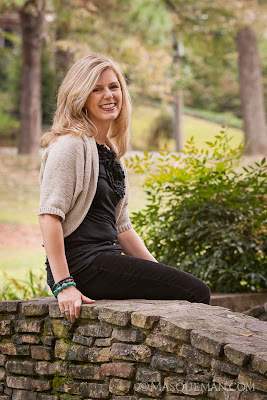
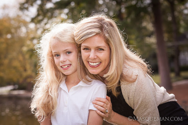
I have known Lisa since the 90’s when I worked with her at my day job at Graphic Works. A lot has happened since those days, but one thing has remained the same. She is one of the nicest people that you will meet, and she has a zest for life. She’s Italian… what did you expect.

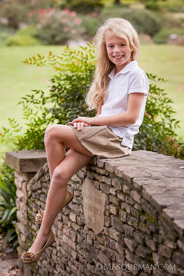
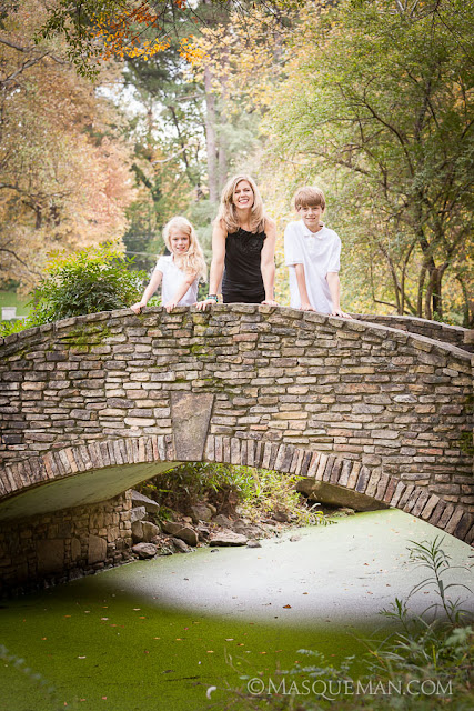
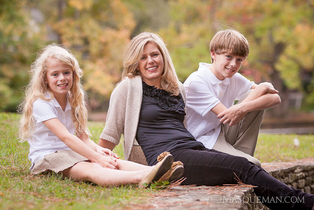
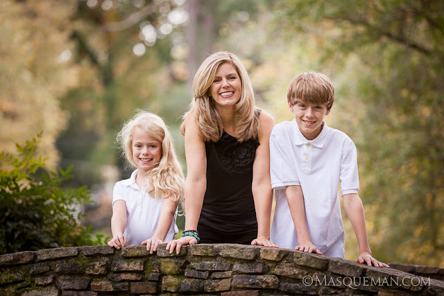
Her two children, Graham and Marissa, have the same adventurous spirit, and they are just fun to be around. Every couple of years we get together for a photoshoot and to compare how much bigger the kids have gotten. I do not know what she is feeding them, but they are growing like weeds.

Here are a few photos from that day. The Fall colors were not really in “bloom” yet in Atlanta, but they were on the verge of changing. The day was very overcast which I prefer over too-strong sunlight. This can give a hazy feel to the photos and the colors don’t pop as much as would strongly backlit leaves.

I hope to keep doing this with them for many years to come. It will be great to look back and remember the journey. To see last time’s photos, check out the previous Gallery Link here.

It is not hard to figure out who Marissa will look like when she grows up.

It was a very nice day spent with old friends.

Corporate Group Photo in a Narrow Gray Box

By Andrew Hughes, corporate photography, Graphic Works, group photography, headshot portraits, Masqueman Photography, photography
Sometimes the locations where I am hired to make portraits are not very exciting. Let’s be honest, many American corporate offices are basically gray painted boxes. In the case below,  it was a narrow conference room in which I needed to make an eight person corporate group photo.You cannot tell form this angle, but I would have been hard pressed to squeeze behind the subjects.

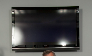
Because of the tight confines of the room, my only option was to set up two large strobes to the right and left of me at the close end of the table, and push light into the room. This was not ideal because of the glass display at the end of the room showed the reflections of the strobes very clearly. Also, the frame rate of the screen was giving me weird partial images. In the end, I just decided it was faster and more efficient to put the logo in post-production.

People have asked why I did not just use the fluorescent overhead lights to make the photo. There are a few reasons. First  fluorescent lights flicker unevenly and can cause issues with exposure and color balance. Those can be overcome, but it just adds complexity to the shoot. Secondly, there is not as much light as you might think in the room. Human eyes are much more sensitive than the sensor in my camera. Even at high ISO settings, I would have to set a longish exposure… not good for sharp shots of this many living, blinking people.

Flash captures the scene in 1/100th of a second freezing everyone perfectly. It allows me to control the color and shape of the light more easily, and in this case it made it possible to get the strong reflections in the table… the most interesting part of the photograph.

My Philosophy on Photographing Children

By Andrew Hughes, Atlanta, child phtotography, children, Masqueman Photography
Photographing children is as much psychology and timing as it is a little luck. And, I am not just talking about child psychology either. Dealing with the parents can be just as challenging.

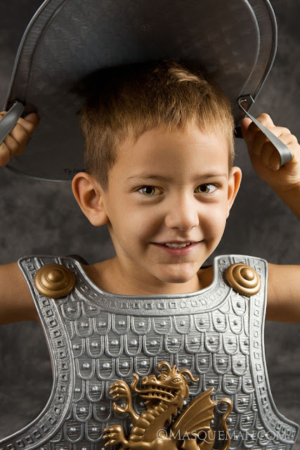
The final usable portrait of Tyler

I once heard a parent threaten their crying child by screeching “Do you want a spanking? If you do not sit there and smile, you will be in big trouble! Quit fidgeting and smile for the camera! Stop crying! You are going to get it when we get home”.

You don’t have to have a PhD to know that this is going to end poorly with either terrified looks, tears or even therapy many years later. Take a chill pill folks… Let kids be kids.

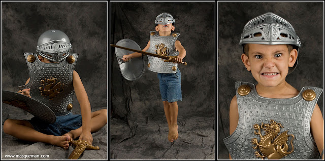
My approach with children is a bit more laid back. I play games with them. I ask them silly questions and make them forget that we are making their portrait. The thing that many adults forget is that children are creative creatures that may come up with a better pose or facial expression all by themselves without being told what to do every second. Sometimes, you just have to get rid of the “sillys” before you can take the portrait, as the photos below clearly show.

Tyler has a lot of personality. I have more silly photos than serious ones… 

I try to get the standard posed shots and then see what the kids do. You just might be surprised what wonderful characters they become. Creativity and personality should not be squashed by overbearing parental behavior. It’s my opinion that sometimes the totally wild photos become our favorites many years later.

My own mother told me that her favorite photo of me as a child shows me crying because I did not like the surly Sears photographer who was trying every trick in the book to make me smile. The story only makes the photo better. Thanks Mom.

Full disclosure…. Tyler is my nephew and nobody was yelling at him except maybe his little sister, Sara. Here she is demonstrating the perfect smile. Oh man, I can’t wait to embarrass them when they are teenagers.

Package & Display Design for Bed Bug Pesticide

By Andrew Hughes, bed bugs, BugBand, EES, Graphic Design, Graphic Works, Inc., insecticide, new products, package design
These bed bugs are
nasty little suckers

Remember that old saying “Don’t let the bed bugs bite”? That was a reality for our parents’ and grandparents’ genrations. That changed when pesticides like DDT were used to devastating effect in the 1940s to practically wipe out bed bugs infestations. Decades later DDT was determined to be environmentally and medically dangerous and taken off the market. It is an unpleasant fact that bed bugs (that were once a thing of past) are now coming back with a vengeance in hotels, motels and even theaters.

My client, BugBand, manufacturers natural insect repellent products that deter insects by emitting Geraniol vapors. Geraniol contains a naturally derived extract from Geranium flowers which people have been using for hundreds of years in window boxes to keep insects out of their homes.

These packages are not shown to scale. The one of the left is only a small 3 oz. travel size bottle.

Last year, BugBand introduced their first pesticide aimed directly at bed bugs. Bed Bugs No More! uses a strong concentration of Geraniol to kill bed bug eggs, larvae, nymphs and adult bed bugs. Geraniol dissolves the exoskeleton of the bedbugs and they cannot become immune to the effects. This is different from the nerve agent pesticides that are usually used, and only affect adults insects with developed nervous systems. Bed Bugs No More! is not toxic and safe for humans. This is my layman’s understanding of complicated chemical processes and biology. More information will soon be on the BugBand web site.

Long story short, I got to design the Bed Bugs No More! packages, two being your standard pump bottle and the other, a small travel size package that uses heat shrink technology to adhere the label to the bottle. In this case, labels are printed as circular plastic sleeves that shrink when heat is applied to them making a colorful and tamper-resistant package. I also designed the displays coming to a store near you.

World War 1 Air Show in Pungo

By Air Show, airplanes, Andrew Hughes, aviation, Masqueman Photography, Military Aviation Museum, photography, Pungo, VA, Virginia Beach, warbirds, World War 1
Almost 100 years ago, the first aerial battles were fought during World War I. It was a different era where new fangled flying machines represented the state-of-the-art in speed and technology. Horse calvary was still relevant and tanks were just appearing in the muddy trenches.

Last year I attended avery unique air show in Pungo, Virginia at the Military Aviation Museum. The featured planes were all World War I vintage, more than likely scaled replicas.
 

Seeing these wood and cloth planes is kind of like looking a kite with a machine gun attached. 

Today we have stealth bombers, remote controlled drones and satellites, but all our current technology owes a great deal to these earlier pioneers and soldiers of the air.

In the photo below, the World War 2 era P-51 snuck into the background and illustrates the difference that 30 years can make on the battlefield, even ones in the air.

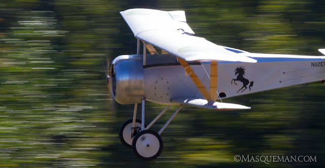
Instead of sitting in a dusty museum, bi-planes and tri-planes zoomed past the crowds in glorious flight.

The first airplanes had less horsepower than most cars on the road today. They employed different shapes and multiple wings for improved lift… two or three wings were better than one, right?

These types of events attract enthusiasts and enactors who are interested in the time period.

Evidently long sleeves were the norm back then, even when it was hot.

I met one gentleman who had an authentic Harley Davidson motorcycle that had seen actual war duty over in France where he found it. It was a joy to see and hear the old hog run. It was a noisy clattertrap.

There were a lot of Germans in uniform.

WW1 machines are not often seen at air shows. In fact, I would say that this was a very rare showing.

The planes had markings that identified the pilot or the air group (or what ever they were called back then).

As the sun went down, hot air balloons were launched over the field.

The fellow below had a solo hot air balloon just like the urban legend about the guy that tied a bunch of helium balloons to his lawn chair.

This show gets top rank, and should not be missed if you are in the Virginia Beach area.

Product Photography & Head Shot Portraits for Georgia Expo

By Andrew Hughes, corporate photography, Georgia Expo, Graphic Works, headshot portraits, Masqueman Photography, product photography
It was time to update the company directory for Georgia Expo, an Atlanta manufacturing company who I had previous worked for. This time around, I made 10 head shots portraits. It was a simple lighting setup. Nothing elaborate going on here.

The tricky part was timing the portraits with the ear splitting industrial noise in the warehouse where we were shooting. No office space was available so we set up a portable studio in the only place left in one of the cavernous warehouse rooms. Every 10 minutes or so the world’s largest air compressor would crank up reproducing the sound of 50 blacksmiths hammering horseshoes, machine gun fire and a pipeless Harley Davidson sounding off at the same time.

The portraits were just part of a 3 day product shoot for their web site and catalog. We took product photos of items ranging in size from 20 foot trade show booths to small hand sized parts and pieces. If you have ever been to a trade show or convention center, you have seen Georgia Expo’s products without knowing it. They make curtain and drape barriers that make up the different booths at events. They make huge divider curtain walls, stanchions, tables and so on. Here is a sampling…

Here are the carts for the moving all the trade show parts. Some weigh several hundred pounds.

Some candid environment photos were taken too. All those curtains are sewn by hand by fast seamstresses.

The storage area is huge and contains lots of already manufactured parts.

These tough guys only smiled after I promised lunch… just kidding. I had to pay them money.

Model Room Photos for Melia Atlanta Hotel

By Andrew Hughes, architecture, Atlanta, corporate photography, interior photography, Masqueman Photography, Melia Hotel, photoshop tricks
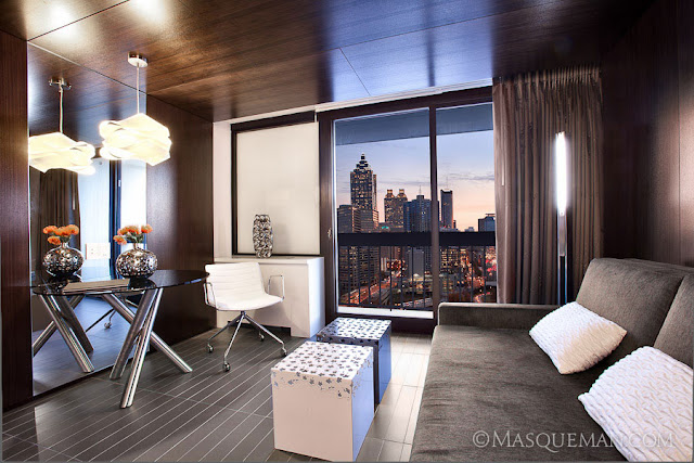
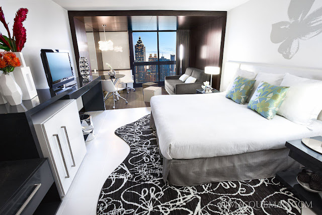
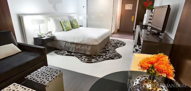
I was hired by the Melia Hotel in Atlanta to photograph their new model room, a designer’s mockup of what the remodeling will look eventually for other rooms. Photographing architectural interiors can be challenging for many reasons…. finding the right angle, different light sources, cramped spaces, and materials.

The shiny wood paneling reflected everything. This looks great in person, but can be difficult to accurately photograph.

The materials in the room ranged from dark glossy wood paneling and tile to flat white linen and shiny chrome vases. I knew that I would not be able to capture the extreme latitude of the room with a single exposure, so I planned to find the best angle and then lock the scene down on my tripod.

To complicate things, there were at least five different light sources with their own color temperature…. blue daylight, green fluorescents, yellow tungstens, white LEDs and my flashes. Each light source was affecting colors and creating pools of localized color zones.

There were large areas of white in this room which were easily affected by colors of the different light sources.

Since I could not simply gel my flash to match all the light temperatures, I ended up shooting each part of the scene separately and composting them later. This allowed me to expose for highlights, midtones and shadows to create a high-dynamic range photo while controlling the color casts. This also allowed me to combine the bright scene outside the window with the relatively dark interior… impossible to do in one shot.

When lighting rooms with flash, try not to overpower ambient light sources that give the room its character. In the photo above, I shot a flash through the frosted glass shower wall which is a key feature of the room’s swanky design. You can see they spent a lot of money on custom glass walls in the restroom.

I also took photos of the room next door which was more of a standard hotel room. It’s pretty interesting to see the difference between the two. This room had the gauze-like sheer curtain that would have helped tame the other room’s extreme lighting conditions. Oh well.

The last shot looks easy, but it was difficult to hide the flashes while lighting both rooms. Again, the shiny materials revealed all light sources so I had to be sneaky where I put my lighting.

OCI Corporate Headshots & Group Photos

By Andrew Hughes, architecture, corporate photography, Graphic Works, group photography, headshot portraits, location photography, Masqueman Photography, portrait photography
I was recently asked to make headshot portraits for OCI, a chemical company located in Atlanta. Due to hectic client schedules, I took two portraits in our studio and 2 in their offices. They had to match existing photo styles so I took great care in replicating the light and keeping it consistant across two locations. I do this by making anal-retentive measurements of every piece of equipment. I can make the same photo years  later if more shots are needed.

While in their office I also took photos of their new conference room which looks like it would be a great place to get business done or maybe challenge your friends to XBOX 360 on their big display screen.

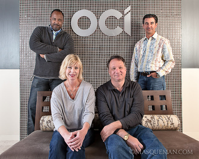
As a surprise, our client also asked us to also make photos of 5 groups of workers in different departments. This had not been discussed previously, but it provides a great lesson in being prepared. Like many photographers, I tend to load up my car with backup cameras, extra lights and gear for such events. It is better to have too much and be ready than tell a client that I can’t do what they ask.

Instead of picking 7 locations and 7 different setups, we chose 1 location near the front entrance that had metallic mirror tile, mixed color lighting and a brushed aluminum logo. This presented a lighting challenge since any lights that I used would bounce back into to the lens revealing themselves as annoying hotspots. Even my largest umbrella diffusers did not tame the reflections. I decided to bounce the flashes off of the hallways walls to give a soft light. Think of this as the photographic equivalent of a bank shot.

For the top brass, we went very informal which was a refreshing change from stuffy CEO power portraits.