How does one balance the product name and image, key points, primary and secondary branding, box orientation, special callouts, required information etc. etc.?
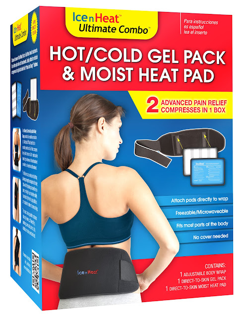
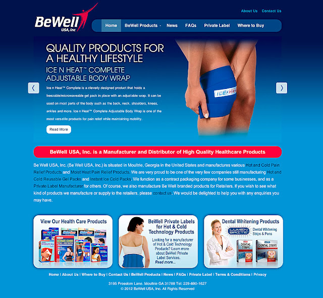
Here is the final box for Ice N Heat’s Ultimate Combo which is a unique hot and cold compress product. It contains 2 types of compresses that attach to the same body wrap using velcro. Anyway, there is a lot the box front needed to say, and it was like a puzzle to get them all to fit. This is version #18… which is shows how many layouts and alternate text versions were tried.
This particular client, BeWell USA, Inc., makes their own health-based products, but also makes private label versions on request for pharmacy chains. This is a factor in the design that required that I keep the primary branding area easily changed out with different logos.
This project included graphic design, photo retouching, illustration, copywriting and marketing… the whole shebang.
 |
| These bed bugs are nasty little suckers |
Remember that old saying “Don’t let the bed bugs bite”? That was a reality for our parents’ and grandparents’ genrations. That changed when pesticides like DDT were used to devastating effect in the 1940s to practically wipe out bed bugs infestations. Decades later DDT was determined to be environmentally and medically dangerous and taken off the market. It is an unpleasant fact that bed bugs (that were once a thing of past) are now coming back with a vengeance in hotels, motels and even theaters.
My client, BugBand, manufacturers natural insect repellent products that deter insects by emitting Geraniol vapors. Geraniol contains a naturally derived extract from Geranium flowers which people have been using for hundreds of years in window boxes to keep insects out of their homes.
 |
| These packages are not shown to scale. The one of the left is only a small 3 oz. travel size bottle. |
Last year, BugBand introduced their first pesticide aimed directly at bed bugs. Bed Bugs No More! uses a strong concentration of Geraniol to kill bed bug eggs, larvae, nymphs and adult bed bugs. Geraniol dissolves the exoskeleton of the bedbugs and they cannot become immune to the effects. This is different from the nerve agent pesticides that are usually used, and only affect adults insects with developed nervous systems. Bed Bugs No More! is not toxic and safe for humans. This is my layman’s understanding of complicated chemical processes and biology. More information will soon be on the BugBand web site.
Long story short, I got to design the Bed Bugs No More! packages, two being your standard pump bottle and the other, a small travel size package that uses heat shrink technology to adhere the label to the bottle. In this case, labels are printed as circular plastic sleeves that shrink when heat is applied to them making a colorful and tamper-resistant package. I also designed the displays coming to a store near you.
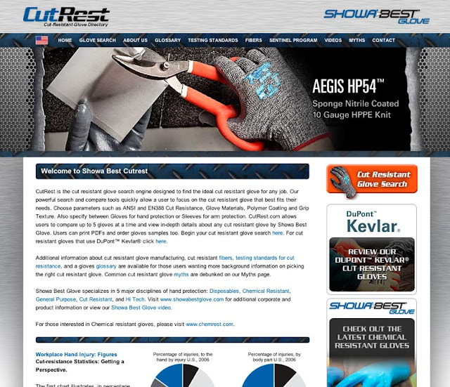
Our task was to create a search engine for their cut resistant product line. With so many choices available to customers, it can be overwhelming to find the perfect glove for the job. The new search engine allows customers to select gloves based on different parameters and compare their favorites. The parameters include options of materials, color, cut resistance rankings, grip texture and so on.
Once a glove is chosen, they can elect to read detailed information about the glove, order a sample or download a product tech sheet. The site is meant for global use and has been translated into French and Spanish and also supplies different product options for 5 regions.
The site is driven by a massive database which alone was a herculean task to whip into shape after years of bloat and inconsistency. As simple as this site seems, it represents months of work by a small team of programmers, designers and photographers.
It is an ongoing project to update the photography on this site. We have set up a dedicated rig in the studio to make product photos of the palm and top of the glove. This allows us to shoot at a consistant angle in similar lighting for a reduced cost to the client.
We also shoot application photos of the gloves in use… This can involve setting up scenes in the studio or going to a location.
The site can be visited at www.cutrest.com
 |
| Presentech’s Tradeshow Product Offerings |
As a graphic designer, I have worked with Presentech in Atlanta, Georgia for probably close to twenty years. As a service bureau, they are unmatched in the small and large format digital print services that they provide. The kind of trust that is built up by such a long relationship is not easy to find in today’s “save a penny” internet world. If you have ever been let down by generic online sellers like I have, then you know how important it is to be able to talk to real people who can help with a rush project or product advice. They have always delivered which has gone a long way to build my own business.
The biggest difference between Presentech and other print related service bureaus, is that they do not wait to make improvements to their products and services. Any time I talk to them, they are expanding or improving upon the products and services they offer… the latest upgrade being in the highly competitive trade show banner stand category.
I should know because I update their web site and have the unique viewpoint of what goes on behind the scenes and also use them as a service provider. I see the products before they become available to the public. I have sold many of these banner stands to client who need something portable to catch attention at tradeshows.
Presentech’s banner stands include the top of the line EXPOLINC banner stands, premium retractable banner stands, non retracting banner stands and value banner stands. I highly recommend their products and you should check out the Presentech web site if the need arises.
For this year’s corporate safety campaign, I was asked to photograph groups of workers in factory settings wearing safety gear. Kimberly-Clark considers safety a top priority and their “Who’s Counting on You” awareness program is designed to remind workers that they should be safe for their own good, the health of their coworkers and for their families who depend on them.
Due to time and budget constraints, the previously planned on-location factory photos turned into in-studio portraits. It was not feasible to shut down part of a busy factory for up to 4 hours at a time. Time is money and that would have cost the company too much.
Plan B involved taking several photos of different poses and expressions in-studio and them compositing them into existing factory environments. The final composites would be used on large posters that will be displayed in multiple languages in factories around the world.
Technically, these seemingly simple photos had some challenges in the studio. The workers were wearing wrap-around safety glasses that reflected light from every angle. I had the models adjust the angle of their faces in small degrees to remove the harsh reflections. Half a degree could make all the difference.
 |
| The photo of the 2 men was taken as one exposure and composited into the background |
The group photos had to have a great depth of field so that all parts of the models were in sharp focus. This involved working with very powerful flashes on almost full power in our small studio. The final tricky part was that the orange safety vests were made of a semi-reflective material that shifted hue with even the smallest difference in flash power. The vests produce a strong local color reflection on the skin of the models which we decided to keep for realism.
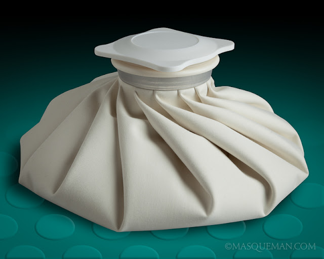
We have all seen the traditional ice bag and probably used them for aches and pains. This updated version by BeWell uses modern technology to improve on an old design. This bag can handle warm or cold water and it has special temperature indicators on the bottom of the bag to let the user know when it is time to change the warm water or ice in the bag. The snowflake symbol appears when the bag is icy cold or the sun symbol appears when it is time to add more warm water. Pretty neat…no guessing involved.
For this project, I took photos of the ice bag in several different angles, using a soft light side light to accentuate the folds of the bag. I was careful to control the highlight to shadow ratio so that the photo would have detail in the shadows on the future packaging.
I designed a medium and large box for the bags based on BeWell’s retail packaging style. Look for them in store near you.
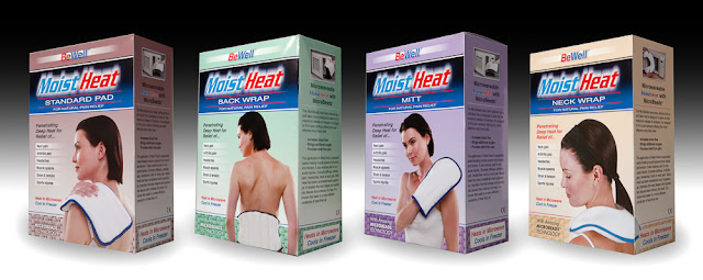
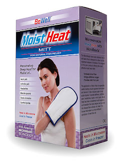
BeWell is a company that makes many of the healthcare-related products that one may find in drug stores. Some of those products include moist heat bags that are warmed in a microwave before applying to one’s body. The old packaging was a cylinder of of plastic with a paper label insert. This took up too much shelf space and was too expensive.
A more efficient, compact and cheaper packaging solution was needed. Pennies saved per package can add up over a year’s time and make a huge difference in the profit margin. The cyclider design was transferred to small boxes.
I hand built sample boxes for an investor meeting and took photos for future promotional materials. I tend to shoot products like this one box at a time and then assemble them into groups as needed. This gives me the same perspective on each product photo and they look better in catalogs and web sites at a consistent angle. I can also change the backgrounds easily depending on what is needed.
At Graphic Works, we often get requests from our clients to assist with their email marketing campaigns. Most of the time these campaigns are designed to go to their clients who have opted-in to their advertising programs. Other times, they they are for internal use to let employees know important breaking news.
In the case of Showa Best Glove, I got to design a header and layout for their first news blast. By building the first template, I could turn it over to my client who can fill in the blanks on subsequent editions. The sample below looks really long, but it scrolls perfectly in an email reader.

