Category

Graphic Works

Hero Photography for Corporate Safety Campaign

By Andrew Hughes, corporate photography, Graphic Works, KC, Kimberly-Clark, PPE, safety
See last year’s campaign

Kimberly-Clark is a world class corporation that makes many of the brand name products you might use everyday like Kleenex, Huggies and Cottonelle. Every year they have a Safety Campaign aimed at maintaining the safety-culture of their company. Last year I took a set of photos of workers decked out in Personal Protection Equipment, or “PPE” as it is known in the biz. See previous campaign.

This year, the theme changed slightly from workers in the factory to family members. It was decided to use a young child and his father for the “hero” photo. This was a real father and son to make it more realistic, and it was probably the only way to do it. The young boy was no more than 5 years old so we would be fighting a short attention span. Having the parents there would help me coax the emotions that the art director was asking for. This is was challenging for many reasons.

The concept for the photo was that the boy would be seen hugging his father dressed in Dad’s PPE which consisted of safety goggles and vest. This is where the process got fun. The art director wanted black hair and a black shirt on a black background. Not only that, the boy was to wear wrap-around, highly reflective safety glasses that reflect EVERYTHING! I knew this was going to be a challenge to light.

In all, I used 1 softbox, 1 umbrella fill, 1 horizontal strip light and 1 gridded spot light and some reflectors. Removing any of those would have made parts of our subjects fade into the black background especially the hair.

All the safety goggles were highly reflective and showed all my studio lights. The highlights had to be managed.

We tried 3 different sets of goggles to give the art director a choice, and soon we were done. I tried every trick in the book to get the right expression from our young talent… I even bribed him with a robot from my childhood toy collection. Talk about going the extra mile.

The retouching phase of the project got a bit “hairy” as I removed individual stray hairs, and gave the Dad a hair cut. Below is a BEFORE and AFTER detail of the photo.

BEFORE Retouching
This process involved rebuilding the shirt collar and skin texture on the neck, plus adding back digital hairs in certain locations. I also removed a major unavoidable softbox reflection and added some color to the boy’s eyes. Overall, I am very pleased with the results given the circumstances.
AFTER Retouching
This poster will be translated into 21 languages and hung up in factories all over the world. Pretty cool.

Web Site Design for BugBand Insect Repellent

By BugBand, Graphic Works, web site design
Every couple of years, I get to update the web site for one of my oldest clients, BugBand Natural Insect Repellent. I went very colorful with an emphasis on green which is now a major direction for the retail packaging and displays.

My favorite enhancement to the site is the new graphic headers on many of the pages. I wanted to show the various situations where the products could be used. Visit the site at www.BugBand.net.

Corporate Headshots and Executive Group Photos for Q-Spex

By Andrew Hughes, corporate photography, Graphic Works, group photography, headshot portraits, Masqueman Photography, QSpex
I get to make a lot of headshot portraits for corporate clients. Instead of the client coming to my studio, it is usually more convenient for me to show up at their office with a portable setup. Scheduling is always an issue with busy executives so we time the photoshoot on a day when everyone is in town.

To make the photos consistently sized, I visualize the final proportions of the portrait. Sometimes I crop the photo very tight if it going to be used for low-res applications such as websites. That way, the face is larger and easier to see.

It is important to be fast and efficient when making these portraits. The last thing you want to do is waste the time of someone who has meetings planned all day. To do this, I shoot with my camera tethered to a laptop computer. As soon as I take the photo, it is transferred to the computer where we can review it. After several shots, we pull all the photos up on screen, and we pick the best one… usually by process of elimination. It is rare when we do not all agree on the final choice.

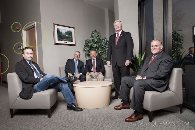
When I first visited the QSpex building, I was drawn to the front entrance that had a sitting area next to a huge window. Window lit portraits are things that photographers dream of… unless the sun is pouring in like bright white laser beams as it was that day.

The day we showed up was overcast which was very lucky indeed. I still could have made it work with  bright sun, but maybe not without a more complex multi-light setup. There was no time for that since one of the executives had a lunch meeting and had to leave. Nothing like performance under pressure, but that is always part of the game. I set up a huge and high umbrella and fired off several frames concentrating on the placement of the executives. The basic photo is below marked with things that I did not like.

I am not a photo journalist so I am not bound by truthful reality. If I think I can make the final image better by retouching, compositing, tweaking or outright removal of distractions… I will do it. Of course, I do share this fact with the client and let them see both versions… just in case they like fire alarms and closet doors. The cleaned up image is below.

I knew we would be making a web site for QSpex also so I wanted to make sure I could use the group photo in a web banner which has more of a 16:9 aspect ratio. See it still works this way.

And finally, the image must work as a black and white photo. I often turn images to grayscale to make sure that they have enough detail and contrast to work without color.

Web Site Featuring the World’s 1st Biodegradable Nitrile Glove

By Andrew Hughes, biodegradable nitrile gloves, Graphic Works, green products, Green-Dex, Showa Best Glove, web site design
One of the hottest topics today in business is “being green”. This can involve saving energy, recycling,  using recycled materials, or reducing waste products. Showa Best Glove has hit a home run with their latest hand protection product called GREEN-DEX at www.Green-Dex.com. I got to design the web site.

Why is a Biodegradable Disposable Nitrile Glove So Important?

Disposable nitrile gloves get used and thrown away by the millions per year. Imagine a job requiring constant glove changes by a single worker. Now multiply that number by a large workforce over a year’s time, and one can see the result will be staggering mountain of gloves and tons of waste material.

Little things add up to be a lot of space in a land fill… especially if they do not quickly break down when exposed to wind, rain or the tiny organisms that turn a pile of trash into dirt. The chart shows how much faster Green-Dex breaks down compared to standard nitrile which barely moves at all on the scale.

GREEN-DEX™ packaging is also made from 100% post-consumer waste
and dispensers from 100% recycled material.

Different Materials Can Take Many Years to Biodegrade in a Landfill

I find it interesting to see how long everyday items take to biodegrade and the chart tells the tale of common things we throw away everyday. If this does not convince people to think more seriously about recycling, I am not sure what will.

Product Time to Biodegrade
Apple core 1–2 months
General paper 1–3 months
Paper towel 2–4 weeks
Cardboard box 2 months
Cotton cloth 5 months
Plastic coated milk carton 5 years
Wax coated milk carton 3 months
Tin cans 50–100 years
Aluminium cans 150–200 years
Glass bottles Undetermined (forever)
Plastic bags 10–20 years
Soft plastic (bottle) 100 years
Hard plastic (bottle cap) 400 years

All this talk about trash reminds me of my favorite commercial from the seventies…

Corporate Group Photo in a Narrow Gray Box

By Andrew Hughes, corporate photography, Graphic Works, group photography, headshot portraits, Masqueman Photography, photography
Sometimes the locations where I am hired to make portraits are not very exciting. Let’s be honest, many American corporate offices are basically gray painted boxes. In the case below,  it was a narrow conference room in which I needed to make an eight person corporate group photo.You cannot tell form this angle, but I would have been hard pressed to squeeze behind the subjects.

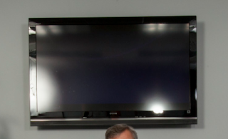
Because of the tight confines of the room, my only option was to set up two large strobes to the right and left of me at the close end of the table, and push light into the room. This was not ideal because of the glass display at the end of the room showed the reflections of the strobes very clearly. Also, the frame rate of the screen was giving me weird partial images. In the end, I just decided it was faster and more efficient to put the logo in post-production.

People have asked why I did not just use the fluorescent overhead lights to make the photo. There are a few reasons. First  fluorescent lights flicker unevenly and can cause issues with exposure and color balance. Those can be overcome, but it just adds complexity to the shoot. Secondly, there is not as much light as you might think in the room. Human eyes are much more sensitive than the sensor in my camera. Even at high ISO settings, I would have to set a longish exposure… not good for sharp shots of this many living, blinking people.

Flash captures the scene in 1/100th of a second freezing everyone perfectly. It allows me to control the color and shape of the light more easily, and in this case it made it possible to get the strong reflections in the table… the most interesting part of the photograph.

Package & Display Design for Bed Bug Pesticide

By Andrew Hughes, bed bugs, BugBand, EES, Graphic Design, Graphic Works, Inc., insecticide, new products, package design
These bed bugs are
nasty little suckers

Remember that old saying “Don’t let the bed bugs bite”? That was a reality for our parents’ and grandparents’ genrations. That changed when pesticides like DDT were used to devastating effect in the 1940s to practically wipe out bed bugs infestations. Decades later DDT was determined to be environmentally and medically dangerous and taken off the market. It is an unpleasant fact that bed bugs (that were once a thing of past) are now coming back with a vengeance in hotels, motels and even theaters.

My client, BugBand, manufacturers natural insect repellent products that deter insects by emitting Geraniol vapors. Geraniol contains a naturally derived extract from Geranium flowers which people have been using for hundreds of years in window boxes to keep insects out of their homes.

These packages are not shown to scale. The one of the left is only a small 3 oz. travel size bottle.

Last year, BugBand introduced their first pesticide aimed directly at bed bugs. Bed Bugs No More! uses a strong concentration of Geraniol to kill bed bug eggs, larvae, nymphs and adult bed bugs. Geraniol dissolves the exoskeleton of the bedbugs and they cannot become immune to the effects. This is different from the nerve agent pesticides that are usually used, and only affect adults insects with developed nervous systems. Bed Bugs No More! is not toxic and safe for humans. This is my layman’s understanding of complicated chemical processes and biology. More information will soon be on the BugBand web site.

Long story short, I got to design the Bed Bugs No More! packages, two being your standard pump bottle and the other, a small travel size package that uses heat shrink technology to adhere the label to the bottle. In this case, labels are printed as circular plastic sleeves that shrink when heat is applied to them making a colorful and tamper-resistant package. I also designed the displays coming to a store near you.

Habitat for Humanity Group Photo

By corporate photography, Graphic Works, group photography, Masqueman Photography, portraits

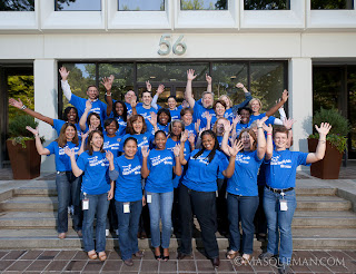
Last week I made a deceptively simple group photo for an Atlanta insurance company who had participated in Habitat for Humanity. I think 80% of the company helped build a house. Impressive. The day before the portrait, my boss took an iphone snapshot of the location. I could tell it was going to be relatively dak because we were shooting on the shadow side of the building.

I know it sounds ludicrous to say that shooting outside at 11 am will be dark, but everything is relative. Because I was shooting rows at least 5 people deep, I needed to have the subjects in the front row and back row equally in sharp focus.

Celebrating their accomplishment

This meant that I would need to use a small aperture for maximum depth of field. Small apertures need long exposures to gather light which would not work with a group of blinking people. The other option was to add light to the scene.

I set up a single flash 10 feet to the right of the camera’s position and aimed it towards the crowd. The resulting image has the appearance of sunlight… if one is not a forensic specialist who can trace the origin of the light source. Without the flash, the photo would have lacked contrast, sharpness and definition. I used a slow enough shutter speed to let the flash and ambient light mix.

Product Photography & Head Shot Portraits for Georgia Expo

By Andrew Hughes, corporate photography, Georgia Expo, Graphic Works, headshot portraits, Masqueman Photography, product photography
It was time to update the company directory for Georgia Expo, an Atlanta manufacturing company who I had previous worked for. This time around, I made 10 head shots portraits. It was a simple lighting setup. Nothing elaborate going on here.

The tricky part was timing the portraits with the ear splitting industrial noise in the warehouse where we were shooting. No office space was available so we set up a portable studio in the only place left in one of the cavernous warehouse rooms. Every 10 minutes or so the world’s largest air compressor would crank up reproducing the sound of 50 blacksmiths hammering horseshoes, machine gun fire and a pipeless Harley Davidson sounding off at the same time.

The portraits were just part of a 3 day product shoot for their web site and catalog. We took product photos of items ranging in size from 20 foot trade show booths to small hand sized parts and pieces. If you have ever been to a trade show or convention center, you have seen Georgia Expo’s products without knowing it. They make curtain and drape barriers that make up the different booths at events. They make huge divider curtain walls, stanchions, tables and so on. Here is a sampling…

Here are the carts for the moving all the trade show parts. Some weigh several hundred pounds.

Some candid environment photos were taken too. All those curtains are sewn by hand by fast seamstresses.

The storage area is huge and contains lots of already manufactured parts.

These tough guys only smiled after I promised lunch… just kidding. I had to pay them money.

OCI Corporate Headshots & Group Photos

By Andrew Hughes, architecture, corporate photography, Graphic Works, group photography, headshot portraits, location photography, Masqueman Photography, portrait photography
I was recently asked to make headshot portraits for OCI, a chemical company located in Atlanta. Due to hectic client schedules, I took two portraits in our studio and 2 in their offices. They had to match existing photo styles so I took great care in replicating the light and keeping it consistant across two locations. I do this by making anal-retentive measurements of every piece of equipment. I can make the same photo years  later if more shots are needed.

While in their office I also took photos of their new conference room which looks like it would be a great place to get business done or maybe challenge your friends to XBOX 360 on their big display screen.

As a surprise, our client also asked us to also make photos of 5 groups of workers in different departments. This had not been discussed previously, but it provides a great lesson in being prepared. Like many photographers, I tend to load up my car with backup cameras, extra lights and gear for such events. It is better to have too much and be ready than tell a client that I can’t do what they ask.

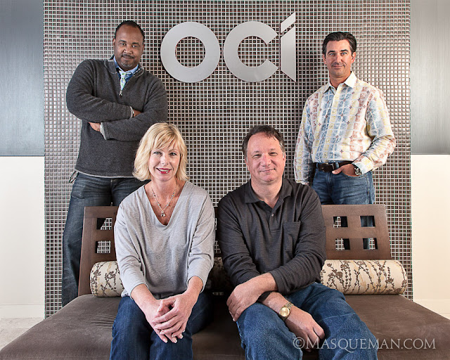
Instead of picking 7 locations and 7 different setups, we chose 1 location near the front entrance that had metallic mirror tile, mixed color lighting and a brushed aluminum logo. This presented a lighting challenge since any lights that I used would bounce back into to the lens revealing themselves as annoying hotspots. Even my largest umbrella diffusers did not tame the reflections. I decided to bounce the flashes off of the hallways walls to give a soft light. Think of this as the photographic equivalent of a bank shot.

For the top brass, we went very informal which was a refreshing change from stuffy CEO power portraits.

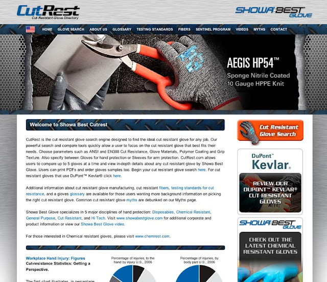
Cut Resistant Glove Search Engine by Showa Best Glove

By Graphic Design, Graphic Works, product photography, web site design
Last year I had the opportunity to work on a complex web design project for Showa Best Glove. They are one of the largest glove manufacturers in the world producing gloves for general purpose, disposable, chemical resistant, cut resistant and hi-tech applications.

Our task was to create a search engine for their cut resistant product line. With so many choices available to customers, it can be overwhelming to find the perfect glove for the job. The new search engine allows customers to select gloves based on different parameters and compare their favorites. The parameters include options of materials, color, cut resistance rankings, grip texture and so on.

Once a glove is chosen, they can elect to read detailed information about the glove, order a sample or download a product tech sheet. The site is meant for global use and has been translated into French and Spanish and also supplies different product options for 5 regions.

The site is driven by a massive database which alone was a herculean task to whip into shape after years of bloat and inconsistency. As simple as this site seems, it represents months of work by a small team of programmers, designers and photographers.

It is an ongoing project to update the photography on this site. We have set up a dedicated rig in the studio to make product photos of the palm and top of the glove. This allows us to shoot at a consistant angle in similar lighting for a reduced cost to the client.

We also shoot application photos of the gloves in use… This can involve setting up scenes in the studio or going to a location.

The site can be visited at www.cutrest.com