Category

Graphic Works

Headshot Portraits for an Atlanta Engineering Firm

By corporate photography, Graphic Works, head shots, headshot portraits, Masqueman Photography, portrait photography
Many of my clients are right in my own back yard. This is especially true with an engineering firm that is located just a mile from the studio. This certainly makes the drive shorter.
Every company has preferences for the types of head shot portraits that I shoot for them. I show examples of styles that I have used in the past and ask if they would like any of the styles that they see. This puts us on the same page so that there are no surprises. This corporation chose a gray background style that has a slight gradient. The lighting ratio on the face is fairly close so no heavy shadows here. 
I have made head shot portraits in just about any kind of corporate room you can imagine from a claustrophobic closet to a normal conference room to a gigantic warehouse space. I can set up a portable studio in the space reserved for me… even a front entrance.
I shoot photos tethered to a computer so that I can show the victim, err, I mean subject the images. This usually makes clients happy because they will not be surprised with a photo that they dislike. I can also give contextual feedback that help the subject improve their posture or smile. 
In the end, I provide finished photos at the ratio they need for their web site (4×5 or 4×6) and another 1×1 ratio portrait for social media sites like Linked-In that use square proportions.
 I am always thrilled to work with neighbors and this was no exception.I even got to meet the office mascot who was notoriously shy. One click of the shutter, and this guy bolted.

Matching the Portrait Style of Another Photographer a Continent Away

By Andrew Hughes, corporate photography, Graphic Works, Masqueman Photography, portrait photography
Photographers often dissect each other’s work to see how a photograph is made. We look for subtle tell-tale signs that show the environment and the light sources for the scene. Trying to recreate another photographer’s style can be very difficult, especially without all the facts. That is what I was asked to do when I was hired to shoot some pickup portraits.
I was tasked to photograph a few of the local Atlanta employees and match the style of the South American office portraits that were already completed. I have the utmost respect for the photographer who took the photos that I was supposed to match. This guy was good and had a wonderful look to his shots. Unfortunately, I do not know this gifted shooter’s name, but his work can be seen in the three photos below.

I was tasked to match these wonderful portraits from another photographer
Try as I might, I could not recreate the scene in the very small office I was given to work in. I got the results below “after the fact” with some photoshop. It was the only way I could do it.
I took the portraits on a white background so that I could composite a background into the scene. The background was pieced together from several of the source photos plus some illustration to extend the blinds.

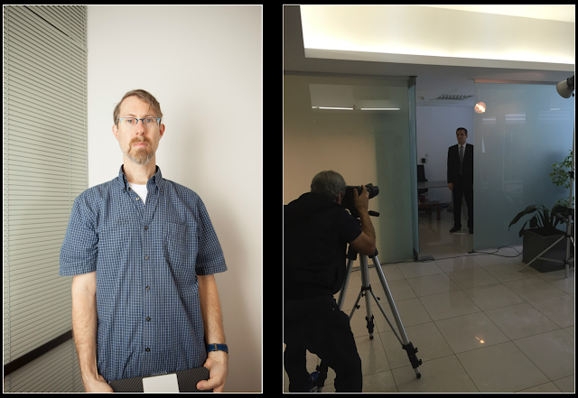
Later on, the client share a very important clue about the original portraits. A behind the scenes picture revealed the extent of the original photographer’s portrait setup inside an office made of frosted glass. The photographer used the large glass wall as a humongous diffuser. Brilliant!
There was zero chance of me using the same techniques in the space I was given, but it all worked out regardless. Whew!

Executive Portraits for Spin-off Healthcare Corporation

By corporate photography, Graphic Works, head shots, headshot portraits, Masqueman Photography
If you have not heard, last year Kimberly-Clark Corporation spun off a $1.8 billion healthcare division resulting in an independent, publicly traded company named Halyard Health. This new entity will be  focusing on preventing infection, eliminating pain and speeding recovery for healthcare providers and their patients.
I was hired to create executive headshot portraits of the international board of directors. I would only have a minuscule 30 minute window of time to do it since their day was crammed with obligations. This meant showing up the previous day to set up my portable headshot studio consisting of a backdrop, 4 lights, a camera and a photographer… that’s me.
I had to cut the set-up short because apparently the flash was bouncing into the board room making people think it was lightning outside. To put it mildly, this was distracting during an important Powerpoint presentation. We all had a chuckle about this later… but not then.
I showed up 2 hours early the next day to finish the setup. Then, during a short break in the meetings, I took all the portraits, packed up and hit the road. Mission accomplished.

Shooting 225 Badge Photo Portraits in 3 Locations

By badge photos, corporate photography, Graphic Works, head shots, headshot portraits, Masqueman Photography
There are different quality levels of portrait photography from a typical DMV mug shot to a multiple-light professional headshot. The difference is all in the lighting and maybe the willingness to make the subject look decent. I was asked to do something in-between, and was hired to make 225 badge photos for a national healthcare company in multiple locations in the Atlanta area.
Many of the subjects shared horror stories of past badge photos during a bad hair day, when a pimple sprouted on the tip of their nose or they got just one attempt. Though a necessity, many employees do not like getting these and they are in a rush to get back to the day’s deadlines or lunch. 
On the flip side, many people are not willing to give up the 10 year old badge photo of their younger self. I made it my personal mission to make them look good and maybe even have some fun. There is nothing fancy with the 2 light setup, but it works for this sort of thing. 
Many of the photos were taken in just 2 shots. I had them write their names on paper and hold them up like they do in a police mugshot. Here’s one guy who is familiar with that concept…just kidding Nick.
Regardless of the quick nature of these utilitarian photos, quite a few of the employees were photogenic… not bad for a badge photo.

Creating an Impromptu Architectural Image for an Atlanta-based Healthcare Company

By Andrew Hughes, architecture, corporate photography, Graphic Works, Masqueman Photography
A photographer must be ready for any hot potato a client throws his direction. It is not always possible to accommodate impromptu requests, but the more versatile I can be, the better.
Perspective corrected image…
While on location setting up a mobile headshot studio for executive portraits, I was asked to make an architectural image of the client’s new building. They had just completed parts of the build-out so this location still had that “new car smell”… and they needed an image the next day.
Outside was dull, dreary and threatening snow. I only had a few moments to snap some images before I was needed inside. I did the best that I could with the 24-70mm portrait lens I had with me. I normally do not bring my wide-angle 16mm lens to portraits so it was this or nothing.

A tilt shift lens would have been handy to dial out the perspective, but that is a rental for me. As such, I had to remove the extreme perspective in Photoshop. There are limited to what looks realistic. The very first image is what a tilt-shift lens might have produced. I’m not sure which I prefer since the second slightly distorted one looks more epic.

Building with some of the perspective left in…
The light played to my advantage with the foggy overcast sky acting like a giant softbox to evenly illuminate the structure’s facades. The sun was cooperative and placed itself directly behind the building allowing parts of the giant glass tower to be both reflective and transparent. 
Out of camera capture…

Of course, the sky had to be replaced with something better than boring white. Above is the original out-of camera shot… I think I added enough drama to make it work.

Atlas Fit Gloves Web Site

By Graphic Works, Showa Best Glove, web site design
Sometimes clients need a fast and affordable way to promote a niche portion of their business. That was the case with Showa Best Glove who wanted a simple informational web site about some of their best selling Atlas gloves. Salesmen use this as a touchstone in their sales calls.

We built a web site to highlight key information about each glove including suggested uses, sizes, materials and photos. In-depth info could be downloaded as a PDF for review or printing.

Product Photography of BBQ Sauce for Atlanta Restaurant

By Andrew Hughes, Atlanta Business, Graphic Works, Masqueman Photography, product photography
Whenever I photograph retail products at Graphic Works, I try to standardize my workflow to save me time and our clients money. This may include setting up a single lighting rig that works for each similar object individually. In the case of this group photo, I shot each bottle alone and then created several versions of group photos and single product shots for print and web use.
This technique is often faster and much more versatile than shooting a group photo to begin with. This is because I can modify the spacing or composition “after the fact”. Plus, I don’t have to worry about nasty reflections of other bottles or complex lighting set-ups. Knowing this in advance can save a lot of headaches in post production.

Web Site for AQuity HD Spectacle Lenses

By AQuity HD, eye care, Graphic Works, lenses, QSpex, web site design, websites
The fun thing about building web sites at Graphic Works is that I get to learn about new and interesting products. Take something as common as eyeglasses… did you ever stop and wonder how they are made? Most of us are told to come back to pick them up, but that is about it.
Our client, QSpex Technologies, Inc. makes the state-of-the-art equipment that allows eye care practitioners to make their own lenses in-house with a liquid monomer in a proprietery molding system.
AQuity HD Web stie

This web site was built to explain the different lens options available in the AQuity HD line of High-Definition lenses. From glare-free to photochromic and anti-glare, you could really get a very high quality pair of glasses without having the wait too long. Check it out at www.AQuityHD.com

Medical Product Photography for Large Corporation

By Andrew Hughes, Graphic Works, Kimberly-Clark, product photography
Some products are more difficult to photograph than others depending on what kind of shape they are in when I get them. We all know that the products that we buy do not look like the photos on the package or that Big Macs look nothing like the idealized photo on the menu.

I have had wrinkled, crinkled, warped, folded, stained and ripped products sent to me which can make my job “interesting”. In cases where I could not get a clean replacement, I sometimes I could fix the product with anything from a hot steam iron and glue to retouching in Photoshop.

Other products are too complicated to shoot without simplifying them. This is the case of some of the heart monitor pouches I photographed for Kimberly-Clark. Imagine a small pouch connected to several feet of ribbon to tie it to the patient. Instead of showing ALL the ribbon (which looked like tangled spaghetti), we got permission to cut them down to a manageable size.

Hopefully, you wil never need to get an IV drip inserted. If you do, these will make the job easier.

These baby items were very small. It is amazing that humans start out this tiny.