(UPDATED) See for yourself below or click here to watch it on YouTube if the video does not play for you.
I am not a video professional per se. I consider myself a photographer who is sometimes tasked with making videos. To me, still photos and moving video are worlds apart that require different equipment, techniques and most of all editing time on the back end.
The plan was simple and necessitated by the fact that I would only have about 10 minutes with each ASC student who was going to appear in the video. I would take a variety of still portraits of each student and then make a recording of their prepared statement of “why I like the Psychology Department”. To simplify this, I had a mic hooked right into the Canon 5D Mkii that I was using. This kept the recording with the person’s images so I could easily combine them later in iMovie. Yep, Apple’s consumer video editor.
This approach worked well for several reasons. First of all, I am better at taking portraits than making video so I decided to stick with my strengths. Another reason is that taking portraits can be much faster than making video. The students would have had to memorize their text and multiple takes would have been required to get the perfect performance. That can barely be done in 10 minutes with professional speakers, much less regular folks.
My wife and I wanted there to be a consistent theme throughout the video to tie everything together. I used a picture frame that read “Why I Like Psych” that would appear in every scene. Each student was also named in the video to make it more personal.
The students that participated did an excellent job, and I believe that they show the diversity and independent spirit alive at that school. Agnes Scott College is a unique school, and I got the feeling that the women who go there love it.
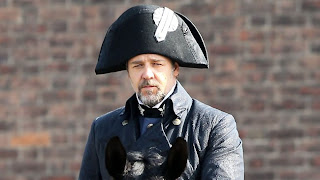
I am breaking tradition on my blog and writing about something other than photography or graphic design. Today is a review of Les Miserables, the much anticipated movie adaptation of the now classic stage show.
The original stage show came out in 1987 when I was in senior in high school. In those days, I hung out with the drama club… which is about as geeky as the glee club is today. Thankfully, I never got on stage, but I would help with the programs and sets. It was fun to be a part of something like that.
I know I may open myself to ridicule to admit that have I listened to show tunes, but that was the year that Les Mis and the Phantom of the Opera came out… and those productions were some of the best ever put on stage.
Les Mis has been made into multiple movie adaptations, but this is the first one based on the Broadway musical. Like everyone else who loved the stage productions, I had my reservations about the actors cast for the lead roles. Would they deliver the role and singing performance the material deserved? The short answers are “yes”and “mostly”… depending on which actor you are talking about.
The producers had an interesting problem to consider when casting. They could have either picked great singers who were might have been relative unknowns or find movie stars who could sing… not always an easy thing to do.
Bringing established actors to the project brings star power which may account for some box office success, but it could backfire if the singers don’t hit the notes. The decision to live record all the singing was an artistic choice to bring the story to life, and give it the emotional gravitas that love, death, sacrifice, revolution and redemption requires.
The acting was excellent by just about every member of the cast. The main characters really dug into their roles and were not afraid to completely lose emotional control… to look ugly, vulnerable or “human”. A pet peeve of mine is seeing an actor’s bag of tricks (Merrill Streep… I’m calling you out). When I see this behavior, I am pulled out of the story and back to reality of a crowded theater. The magic spell is broken.
On the other hand, when an actor is present, committed and completely in the moment, I lose myself in the story. That moment for me in this movie was the “I Dreamed a Dream” scene sung by Anne Hathaway. This is the song they used in teasers leading up to opening day… and with good reason. Her performance was so true, emotional and gut wrenching that it made up for any nit picks I might have had about the rest of the film. It was the bravest performance I have seen on film…and this is where the value of the live singing pays off. Here choices in timing, inflection, emphasis and all those other things I am not qualified to talk about were Oscar worthy (update… this has since come true).
Hugh Jackman turned in the lion-share’s of sung dialog…. though with mixed success. If I am being 100% honest, his voice at times irked me. My wife mentioned it too. Perhaps we are just too used to the 1987 studio version? When I got home, I listened to the 2 versions back to back and while they are simliar in pitch, there is a unique tone that is missing for me. His acting, however, made up for any vocal shortcomings with a load of charisma. I can forgive some of the awkward pauses, lost tunes and a few “just spoken words”. He should be commended for his efforts.
Russell Crowe is a favorite actor of mine and supposedly a singer in a band, and I can forgive his lack of a trained voice too. He tried the best he could. Some of the long extended notes were not going to be possible for him. It did not spoil my enjoyment of the movie, but it made me wonder who else could have played some of these roles…
In the end, I think the director made the right decision to hire film actors instead of stage actors. To me the 2 different arenas require different skills. Modern movie acting requires subtlety and stage shows larger overt actions that can be seen from the back of a theater. The lack of subtlety shows up in moments like Apennine’s “On My Own”. This showstopper usually brings the house down, but this case it felt weak in comparison to more nuanced emotional performances by other actors.
The surprise for me was to see Sasha Baron-Cohen (aka Borat) play the devious inn-keeper, Thenardier. He was great despite the fact that half the time he switched in an out of a French accent in mid-song. Actually, most of the cast had English accents thought the story was in France. Hmmm…. How weird is that?
In a neat cameo, the original actor to play Jean Val-Jean, Colm Wilkinson, made an appearance as the bishop. That was a nice touch, though I did not recognize his voice at all.
Make no mistake. This is a long, emotionally taxing movie where practically every word is sung. If that bothers you, don’t see it. You should really think of it more as a Broadway style show with amazing living sets, no intermission… and only costs $10 (or less if you rent it). Quite a bargain when you think about it.
I have had wrinkled, crinkled, warped, folded, stained and ripped products sent to me which can make my job “interesting”. In cases where I could not get a clean replacement, I sometimes I could fix the product with anything from a hot steam iron and glue to retouching in Photoshop.
Other products are too complicated to shoot without simplifying them. This is the case of some of the heart monitor pouches I photographed for Kimberly-Clark. Imagine a small pouch connected to several feet of ribbon to tie it to the patient. Instead of showing ALL the ribbon (which looked like tangled spaghetti), we got permission to cut them down to a manageable size.
 |
| See last year’s campaign |
Kimberly-Clark is a world class corporation that makes many of the brand name products you might use everyday like Kleenex, Huggies and Cottonelle. Every year they have a Safety Campaign aimed at maintaining the safety-culture of their company. Last year I took a set of photos of workers decked out in Personal Protection Equipment, or “PPE” as it is known in the biz. See previous campaign.
 |
| All the safety goggles were highly reflective and showed all my studio lights. The highlights had to be managed. |
We tried 3 different sets of goggles to give the art director a choice, and soon we were done. I tried every trick in the book to get the right expression from our young talent… I even bribed him with a robot from my childhood toy collection. Talk about going the extra mile.
The retouching phase of the project got a bit “hairy” as I removed individual stray hairs, and gave the Dad a hair cut. Below is a BEFORE and AFTER detail of the photo.
 |
| BEFORE Retouching |
| This process involved rebuilding the shirt collar and skin texture on the neck, plus adding back digital hairs in certain locations. I also removed a major unavoidable softbox reflection and added some color to the boy’s eyes. Overall, I am very pleased with the results given the circumstances. |
 |
| AFTER Retouching |
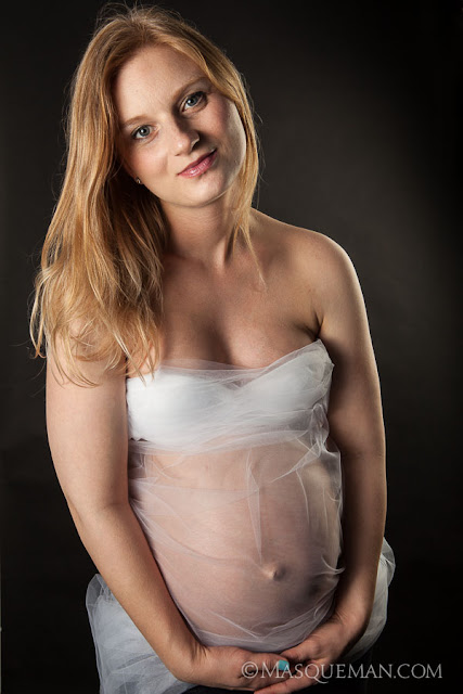
Justinas and Marie are two of my oldest friends in Atlanta. I have know them since the days when riding motorcycles in the north Georgia mountains was a weekly event. We spent many a mile together and had some great adventures. It was wonderful when they got married and then pregnant later on.
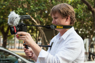
Justinas and his brother, Paulius, are photographers just like their father back in Lithuania. The love of photography is something that we all have in common. Justinas was making a movie of the shoot.
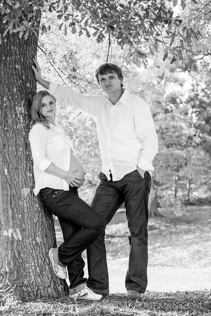
I was honored to be able to take some of these photos of Marie, but I wanted to include Justinas in some too. He is always behind the camera so this time, the roles would be reversed for him. I also thought it would be important to show them as a couple. I love the negative space between them in the next photo.
We decided to meet at my office where we could take advantage of an open studio and also the last remaining Fall foliage outside. Many trees had already lost their vibrancy at this point, but I put my secret weapon to good use… I simply call it the THE TREE. This one always has incredible color.
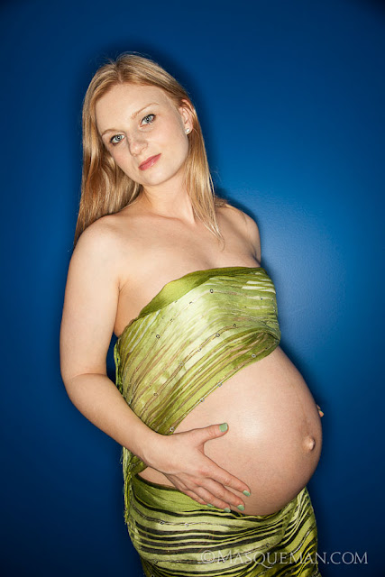
Pretty soon the evening light was toast so we headed indoors to try a few different scenarios. The first was to photograph Marie against a painted blue wall using a ring flash. If you have never seen one of those, it would look similar to sticking your camera lens through the hole of a large doughnut shaped flash. It creates a signature ring highlight in the eyes and a soft shadow around a subject who is in close proximity to a wall. This look is not for everyone, but Marie pulls it off.
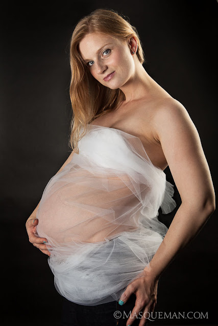
Then I wanted to try some dark background portraits with strong directional light. We used a sheer mesh here.
I wanted a very strong rim light to help define her against the dark background.
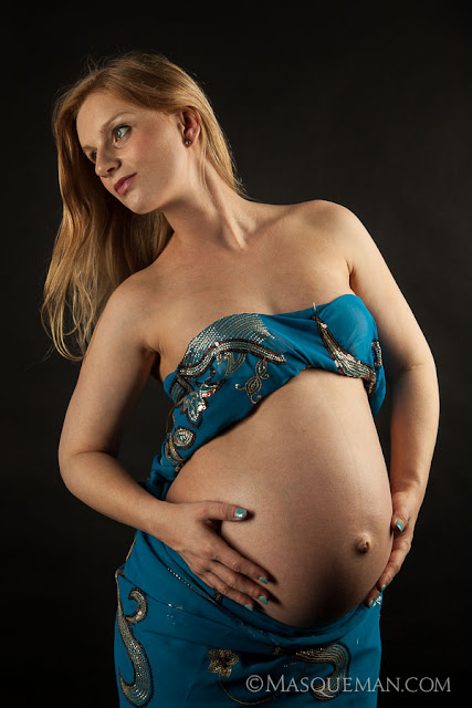
She then changed into something a little less comfortable. How she wrapped herself in this thing is a mystery, but I think I saw her twirling into it while Justinas held the end.
This is one of my favorites because of the modeling on that perfect belly, and the expectant look of motherhood. She will make an incredible mom.
This is one of those cases where I needed to match a style of portrait that I took several years before. Luckily, I meticulously measure the position of my equipment, flash power and camera settings for every job I do. That way if an office manager says “we need a photo of our new doctor and we want it to look JUST LIKE the ones you took 2 years ago, I can do it.
I have even kept old studio flash sets due to recurring jobs… even though I have much more capable and expensive gear now. The bottom line is that it is faster for me to set up the old stuff instead of recalibrate a previous setup with new gear. You can decide for yourself if that makes me smart or lazy.
How does one balance the product name and image, key points, primary and secondary branding, box orientation, special callouts, required information etc. etc.?
Here is the final box for Ice N Heat’s Ultimate Combo which is a unique hot and cold compress product. It contains 2 types of compresses that attach to the same body wrap using velcro. Anyway, there is a lot the box front needed to say, and it was like a puzzle to get them all to fit. This is version #18… which is shows how many layouts and alternate text versions were tried.
This particular client, BeWell USA, Inc., makes their own health-based products, but also makes private label versions on request for pharmacy chains. This is a factor in the design that required that I keep the primary branding area easily changed out with different logos.
This project included graphic design, photo retouching, illustration, copywriting and marketing… the whole shebang.
To make the photos consistently sized, I visualize the final proportions of the portrait. Sometimes I crop the photo very tight if it going to be used for low-res applications such as websites. That way, the face is larger and easier to see.
It is important to be fast and efficient when making these portraits. The last thing you want to do is waste the time of someone who has meetings planned all day. To do this, I shoot with my camera tethered to a laptop computer. As soon as I take the photo, it is transferred to the computer where we can review it. After several shots, we pull all the photos up on screen, and we pick the best one… usually by process of elimination. It is rare when we do not all agree on the final choice.
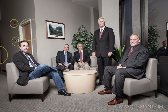
When I first visited the QSpex building, I was drawn to the front entrance that had a sitting area next to a huge window. Window lit portraits are things that photographers dream of… unless the sun is pouring in like bright white laser beams as it was that day.
The day we showed up was overcast which was very lucky indeed. I still could have made it work with bright sun, but maybe not without a more complex multi-light setup. There was no time for that since one of the executives had a lunch meeting and had to leave. Nothing like performance under pressure, but that is always part of the game. I set up a huge and high umbrella and fired off several frames concentrating on the placement of the executives. The basic photo is below marked with things that I did not like.
I am not a photo journalist so I am not bound by truthful reality. If I think I can make the final image better by retouching, compositing, tweaking or outright removal of distractions… I will do it. Of course, I do share this fact with the client and let them see both versions… just in case they like fire alarms and closet doors. The cleaned up image is below.
I knew we would be making a web site for QSpex also so I wanted to make sure I could use the group photo in a web banner which has more of a 16:9 aspect ratio. See it still works this way.
And finally, the image must work as a black and white photo. I often turn images to grayscale to make sure that they have enough detail and contrast to work without color.
Why is a Biodegradable Disposable Nitrile Glove So Important?
Disposable nitrile gloves get used and thrown away by the millions per year. Imagine a job requiring constant glove changes by a single worker. Now multiply that number by a large workforce over a year’s time, and one can see the result will be staggering mountain of gloves and tons of waste material.
Little things add up to be a lot of space in a land fill… especially if they do not quickly break down when exposed to wind, rain or the tiny organisms that turn a pile of trash into dirt. The chart shows how much faster Green-Dex breaks down compared to standard nitrile which barely moves at all on the scale.
 |
| GREEN-DEX™ packaging is also made from 100% post-consumer waste and dispensers from 100% recycled material. |
Different Materials Can Take Many Years to Biodegrade in a Landfill
| Product | Time to Biodegrade |
|---|---|
| Apple core | 1–2 months |
| General paper | 1–3 months |
| Paper towel | 2–4 weeks |
| Cardboard box | 2 months |
| Cotton cloth | 5 months |
| Plastic coated milk carton | 5 years |
| Wax coated milk carton | 3 months |
| Tin cans | 50–100 years |
| Aluminium cans | 150–200 years |
| Glass bottles | Undetermined (forever) |
| Plastic bags | 10–20 years |
| Soft plastic (bottle) | 100 years |
| Hard plastic (bottle cap) | 400 years |


