Category

group photography

A Halloween Wedding in the Theme of Pokémon

By costumes, group photography, Halloween, Masqueman Photography, Pokemon, portrait photography, theme wedding, wedding, weddings
I know what you might be thinking? What in the world do costumes, Halloween, a wedding and a popular game named Pokémon have to do with the ceremony of matrimony? My answer is “who cares?”.  I think that people should be able to do whatever floats their boat on their wedding day.

I had to research Pokémon and here is all you need to know from the Pokémon Wiki: “Pokémon is a multi-media franchise that’s owned and developed by the major Japanese games manufacturer, Nintendo. It is second only to the company’s Mario Brothers franchise in terms of profitability — making it the world’s second most lucrative video game franchise. Pokémon gets its fan base hooked on creature collection — to complete what’s called the Pokédex — in order to achieve various goals and to improve their combat abilities. The franchise exists as several video games, a trading card game, televised anime, manga, and theatrical films.”

Pokémon Characters
A corporate client of mine asked if I was interested in shooting her son’s wedding and then told me about the theme of the event. I actually looked at the calendar to make sure that April Fool’s Day had not snuck up on me.  She was dead serious though so I told her that I would get back to her with an answer.

You see, I gave up shooting weddings a while back. I tell people that they are like surviving a 10 hour battle without food, water and with dwindling ammunition. My opinion is that wedding photography is some of the most demanding shooting (outside of a war zone). The pressure is high to get the photos and you do not get a second chance. You have to be on your game and stay there. God help you if anything goes wrong like your bride eating a handful of Xanax and washing it down with a couple of bottles of wine. That is a true story and the reason I got out of weddings. No thank you.

Regardless of my self-imposed wedding retirement, this was one of my favorite clients, and she needed a favor. I decided to help her and see what kind of wackiness might transpire given the ingredients that she described to me over the phone.

The location was going to be a driveway at her home and it was going to happen on Halloween day. I have shot weddings in driveways before. It can be a challenge to make it look like the wedding is not happening where you park your cars at night. Luckily, there was a valley of Fall foliage behind the chosen location, which is better than seeing neighbors’ houses.

The other issue was the time of day. It was going to be at 1 o’clock when the sun can potentially be harsh and unflattering causing deep shadows and contrasty images. Of course, there are ways to counteract this, but it gets more difficult in a fluid situation and a wedding party of 14 people. On the day of the event, the wedding gods blessed me with diffused cloud cover, which is like using a giant overhead soft box… in layman terms, perfect lighting for weddings.

We decided to make the group photos before the event to get them out of the way. I think this is great because it is time to party after the ceremony. I generally don’t think guests like waiting around while the wedding party is being photographed so this solves that issue immediately.

Here are the ladies. I should point out that the clothes they wore were “inspired by Pokémon”, not actual character costumes. This is provides more variety and room for personalization than the matching uniforms that many wedding parties wear. 

Here are the men. These guys cracked me up. The big hands are obvious but did you notice the medieval style cod piece? It’s there and I cannot show the other photos… ha ha.

I used my trusty Einstein flashes and a giant umbrella to push fill light into the portraits. Technically, I was shooting into the sun so I was lighting the shadows to make them more even with the lighter background.

 The setting was a tiny nook in the front yard. I tried to create the illusion that we were  not surrounded by houses and cars. I am not showing the other groups I photographed, but there were many.

The procession to the ceremony was a great time to grab less formal photos of the wedding party.

The flower girl was dressed as Pikachu, the most famous Pokémon character.

The ceremony was short and sweet. The couple read a passage from a favorite book that was beautiful. It was all over in a flash.

Afterwards, guests moved inside for cake and food. If the front yard was tight, inside was even tighter once  each room was filled wall to wall with people.
I grabbed the couple for a few more outdoor photos when they were not tending to their guests. These ended up being my favorite photos.

Because they were in untraditional wedding attire, I approached their portraits as character studies.

That took the portraits out of the context of a wedding and to me become more mysterious. 

They defy explanation and I like that about them. The world needs more mystery in it and I hope people wonder “what is the story here?”

I enjoyed meeting the wedding couple and their friends. They were some of the coolest young people that I have met who marched to the beat of their own drums. That individuality in itself should be  celebrated in our homogenized world. This is one wedding that the participants nor I will forget.

And, just to see how many themes we could stuff into one wedding, we got light saber photos. This ended up being the coolest theme wedding that I have shot to date. I wish Harry and Devon a long happy life together.

Corporate Headshots and Executive Group Photos for Q-Spex

By Andrew Hughes, corporate photography, Graphic Works, group photography, headshot portraits, Masqueman Photography, QSpex
I get to make a lot of headshot portraits for corporate clients. Instead of the client coming to my studio, it is usually more convenient for me to show up at their office with a portable setup. Scheduling is always an issue with busy executives so we time the photoshoot on a day when everyone is in town.

To make the photos consistently sized, I visualize the final proportions of the portrait. Sometimes I crop the photo very tight if it going to be used for low-res applications such as websites. That way, the face is larger and easier to see.

It is important to be fast and efficient when making these portraits. The last thing you want to do is waste the time of someone who has meetings planned all day. To do this, I shoot with my camera tethered to a laptop computer. As soon as I take the photo, it is transferred to the computer where we can review it. After several shots, we pull all the photos up on screen, and we pick the best one… usually by process of elimination. It is rare when we do not all agree on the final choice.

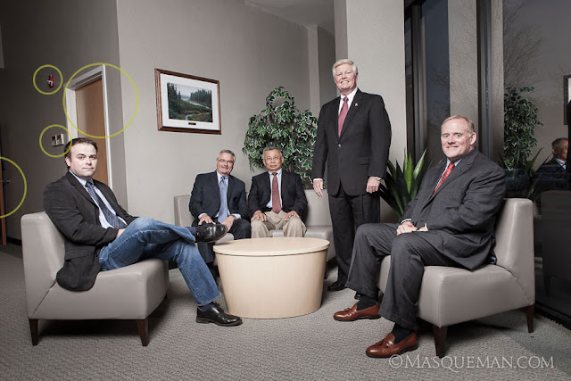
When I first visited the QSpex building, I was drawn to the front entrance that had a sitting area next to a huge window. Window lit portraits are things that photographers dream of… unless the sun is pouring in like bright white laser beams as it was that day.

The day we showed up was overcast which was very lucky indeed. I still could have made it work with  bright sun, but maybe not without a more complex multi-light setup. There was no time for that since one of the executives had a lunch meeting and had to leave. Nothing like performance under pressure, but that is always part of the game. I set up a huge and high umbrella and fired off several frames concentrating on the placement of the executives. The basic photo is below marked with things that I did not like.

I am not a photo journalist so I am not bound by truthful reality. If I think I can make the final image better by retouching, compositing, tweaking or outright removal of distractions… I will do it. Of course, I do share this fact with the client and let them see both versions… just in case they like fire alarms and closet doors. The cleaned up image is below.

I knew we would be making a web site for QSpex also so I wanted to make sure I could use the group photo in a web banner which has more of a 16:9 aspect ratio. See it still works this way.

And finally, the image must work as a black and white photo. I often turn images to grayscale to make sure that they have enough detail and contrast to work without color.

Family Photos with the Humphreys in Atlanta

By Andrew Hughes, Fall colors, family, group photography, Masqueman Photography, portrait photography

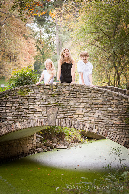
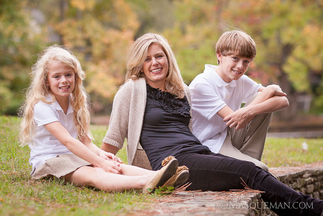
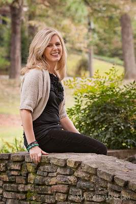
I have known Lisa since the 90’s when I worked with her at my day job at Graphic Works. A lot has happened since those days, but one thing has remained the same. She is one of the nicest people that you will meet, and she has a zest for life. She’s Italian… what did you expect.

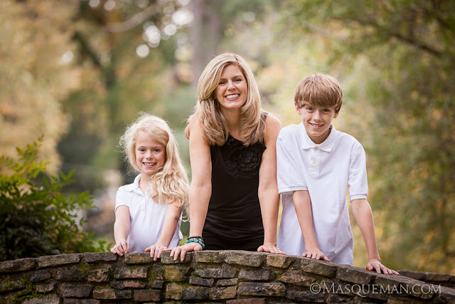
Her two children, Graham and Marissa, have the same adventurous spirit, and they are just fun to be around. Every couple of years we get together for a photoshoot and to compare how much bigger the kids have gotten. I do not know what she is feeding them, but they are growing like weeds.

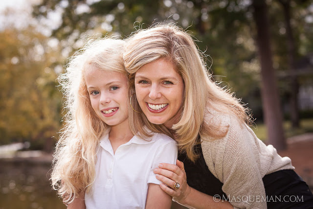
Here are a few photos from that day. The Fall colors were not really in “bloom” yet in Atlanta, but they were on the verge of changing. The day was very overcast which I prefer over too-strong sunlight. This can give a hazy feel to the photos and the colors don’t pop as much as would strongly backlit leaves.

I hope to keep doing this with them for many years to come. It will be great to look back and remember the journey. To see last time’s photos, check out the previous Gallery Link here.

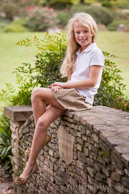
It is not hard to figure out who Marissa will look like when she grows up.

It was a very nice day spent with old friends.

Corporate Group Photo in a Narrow Gray Box

By Andrew Hughes, corporate photography, Graphic Works, group photography, headshot portraits, Masqueman Photography, photography
Sometimes the locations where I am hired to make portraits are not very exciting. Let’s be honest, many American corporate offices are basically gray painted boxes. In the case below,  it was a narrow conference room in which I needed to make an eight person corporate group photo.You cannot tell form this angle, but I would have been hard pressed to squeeze behind the subjects.

Because of the tight confines of the room, my only option was to set up two large strobes to the right and left of me at the close end of the table, and push light into the room. This was not ideal because of the glass display at the end of the room showed the reflections of the strobes very clearly. Also, the frame rate of the screen was giving me weird partial images. In the end, I just decided it was faster and more efficient to put the logo in post-production.

People have asked why I did not just use the fluorescent overhead lights to make the photo. There are a few reasons. First  fluorescent lights flicker unevenly and can cause issues with exposure and color balance. Those can be overcome, but it just adds complexity to the shoot. Secondly, there is not as much light as you might think in the room. Human eyes are much more sensitive than the sensor in my camera. Even at high ISO settings, I would have to set a longish exposure… not good for sharp shots of this many living, blinking people.

Flash captures the scene in 1/100th of a second freezing everyone perfectly. It allows me to control the color and shape of the light more easily, and in this case it made it possible to get the strong reflections in the table… the most interesting part of the photograph.

Habitat for Humanity Group Photo

By corporate photography, Graphic Works, group photography, Masqueman Photography, portraits

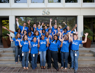
Last week I made a deceptively simple group photo for an Atlanta insurance company who had participated in Habitat for Humanity. I think 80% of the company helped build a house. Impressive. The day before the portrait, my boss took an iphone snapshot of the location. I could tell it was going to be relatively dak because we were shooting on the shadow side of the building.

I know it sounds ludicrous to say that shooting outside at 11 am will be dark, but everything is relative. Because I was shooting rows at least 5 people deep, I needed to have the subjects in the front row and back row equally in sharp focus.

Celebrating their accomplishment

This meant that I would need to use a small aperture for maximum depth of field. Small apertures need long exposures to gather light which would not work with a group of blinking people. The other option was to add light to the scene.

I set up a single flash 10 feet to the right of the camera’s position and aimed it towards the crowd. The resulting image has the appearance of sunlight… if one is not a forensic specialist who can trace the origin of the light source. Without the flash, the photo would have lacked contrast, sharpness and definition. I used a slow enough shutter speed to let the flash and ambient light mix.

OCI Corporate Headshots & Group Photos

By Andrew Hughes, architecture, corporate photography, Graphic Works, group photography, headshot portraits, location photography, Masqueman Photography, portrait photography
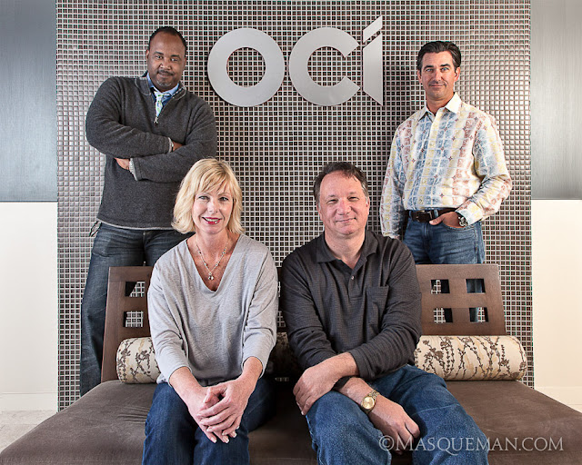
I was recently asked to make headshot portraits for OCI, a chemical company located in Atlanta. Due to hectic client schedules, I took two portraits in our studio and 2 in their offices. They had to match existing photo styles so I took great care in replicating the light and keeping it consistant across two locations. I do this by making anal-retentive measurements of every piece of equipment. I can make the same photo years  later if more shots are needed.

While in their office I also took photos of their new conference room which looks like it would be a great place to get business done or maybe challenge your friends to XBOX 360 on their big display screen.

As a surprise, our client also asked us to also make photos of 5 groups of workers in different departments. This had not been discussed previously, but it provides a great lesson in being prepared. Like many photographers, I tend to load up my car with backup cameras, extra lights and gear for such events. It is better to have too much and be ready than tell a client that I can’t do what they ask.

Instead of picking 7 locations and 7 different setups, we chose 1 location near the front entrance that had metallic mirror tile, mixed color lighting and a brushed aluminum logo. This presented a lighting challenge since any lights that I used would bounce back into to the lens revealing themselves as annoying hotspots. Even my largest umbrella diffusers did not tame the reflections. I decided to bounce the flashes off of the hallways walls to give a soft light. Think of this as the photographic equivalent of a bank shot.

For the top brass, we went very informal which was a refreshing change from stuffy CEO power portraits.