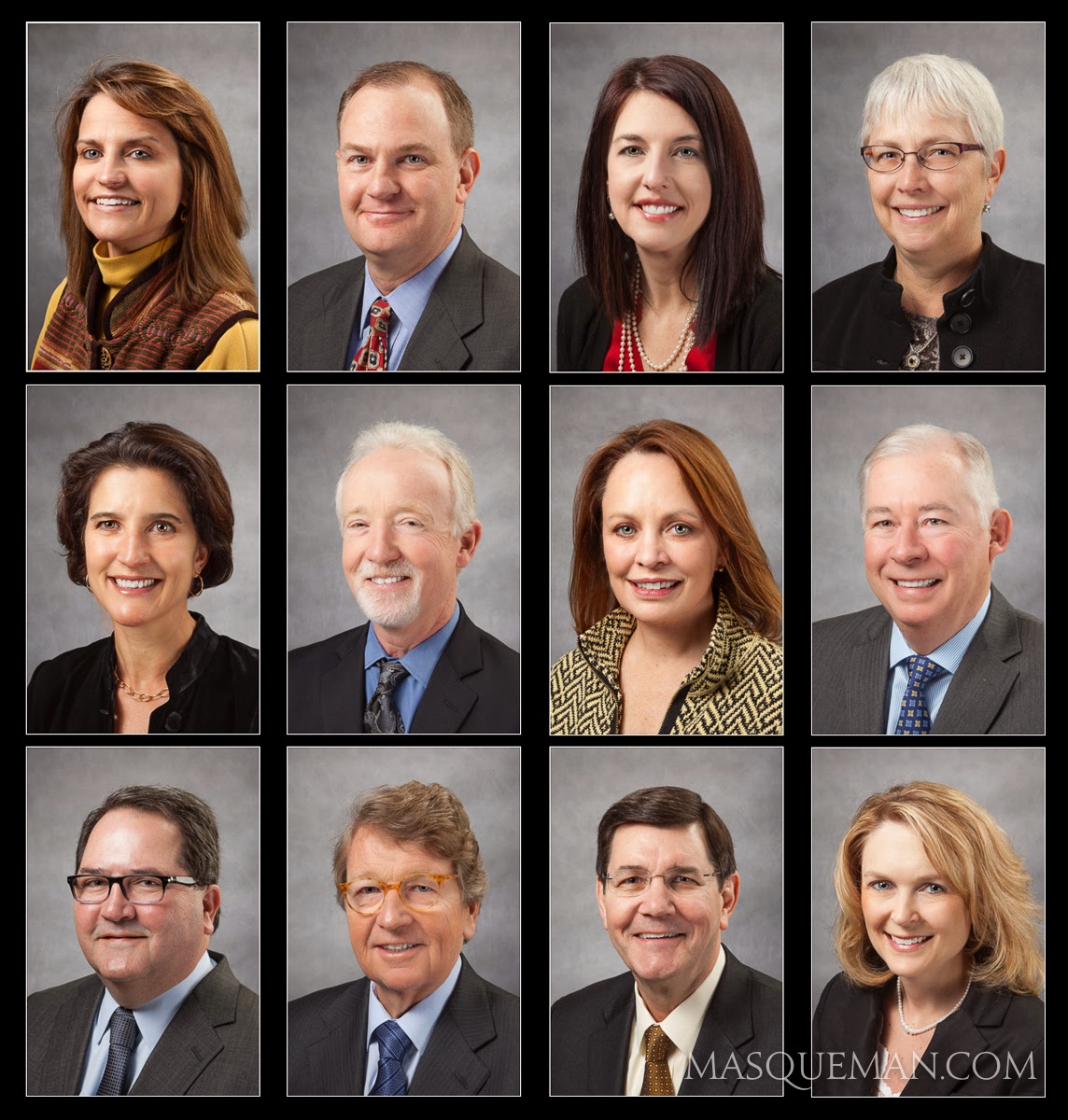
We knocked out the standard business head shots first. Unless I am trying to specifically match the style of a company’s headshot, I tend to shoot a variety of backgrounds for the client. I can do this quickly by moving a few prearranged backdrops.
The requirements for Jason were slightly different since the headshot was going to include his company logo on his shirt. He owns Performance Audio & Video Atlanta…one of the best audio, video and home automation companies in Atlanta. Give him a call if you need any of that.
who contacted me to have portraits made.
Hopefully, that comes through in the photos.
and maybe even for some online dating.
included it. The matching background color ties it all together.
This is one of those cases where I needed to match a style of portrait that I took several years before. Luckily, I meticulously measure the position of my equipment, flash power and camera settings for every job I do. That way if an office manager says “we need a photo of our new doctor and we want it to look JUST LIKE the ones you took 2 years ago, I can do it.
I have even kept old studio flash sets due to recurring jobs… even though I have much more capable and expensive gear now. The bottom line is that it is faster for me to set up the old stuff instead of recalibrate a previous setup with new gear. You can decide for yourself if that makes me smart or lazy.
To make the photos consistently sized, I visualize the final proportions of the portrait. Sometimes I crop the photo very tight if it going to be used for low-res applications such as websites. That way, the face is larger and easier to see.
It is important to be fast and efficient when making these portraits. The last thing you want to do is waste the time of someone who has meetings planned all day. To do this, I shoot with my camera tethered to a laptop computer. As soon as I take the photo, it is transferred to the computer where we can review it. After several shots, we pull all the photos up on screen, and we pick the best one… usually by process of elimination. It is rare when we do not all agree on the final choice.
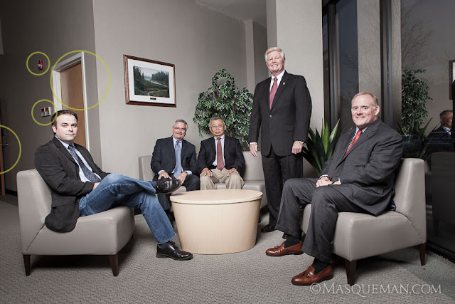
When I first visited the QSpex building, I was drawn to the front entrance that had a sitting area next to a huge window. Window lit portraits are things that photographers dream of… unless the sun is pouring in like bright white laser beams as it was that day.
The day we showed up was overcast which was very lucky indeed. I still could have made it work with bright sun, but maybe not without a more complex multi-light setup. There was no time for that since one of the executives had a lunch meeting and had to leave. Nothing like performance under pressure, but that is always part of the game. I set up a huge and high umbrella and fired off several frames concentrating on the placement of the executives. The basic photo is below marked with things that I did not like.
I am not a photo journalist so I am not bound by truthful reality. If I think I can make the final image better by retouching, compositing, tweaking or outright removal of distractions… I will do it. Of course, I do share this fact with the client and let them see both versions… just in case they like fire alarms and closet doors. The cleaned up image is below.
I knew we would be making a web site for QSpex also so I wanted to make sure I could use the group photo in a web banner which has more of a 16:9 aspect ratio. See it still works this way.
And finally, the image must work as a black and white photo. I often turn images to grayscale to make sure that they have enough detail and contrast to work without color.
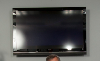
Because of the tight confines of the room, my only option was to set up two large strobes to the right and left of me at the close end of the table, and push light into the room. This was not ideal because of the glass display at the end of the room showed the reflections of the strobes very clearly. Also, the frame rate of the screen was giving me weird partial images. In the end, I just decided it was faster and more efficient to put the logo in post-production.
People have asked why I did not just use the fluorescent overhead lights to make the photo. There are a few reasons. First fluorescent lights flicker unevenly and can cause issues with exposure and color balance. Those can be overcome, but it just adds complexity to the shoot. Secondly, there is not as much light as you might think in the room. Human eyes are much more sensitive than the sensor in my camera. Even at high ISO settings, I would have to set a longish exposure… not good for sharp shots of this many living, blinking people.
Flash captures the scene in 1/100th of a second freezing everyone perfectly. It allows me to control the color and shape of the light more easily, and in this case it made it possible to get the strong reflections in the table… the most interesting part of the photograph.
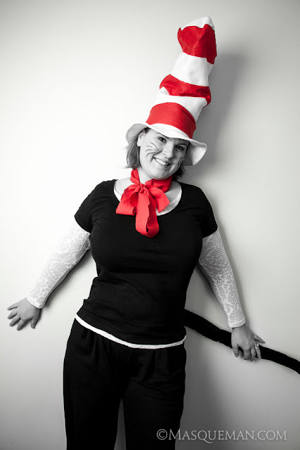
Of course, I could not let this just pass, so while my “official” subject was getting dressed in the other room, I snapped a few quickies. I just kept all the light stands in the same locations, but turned them toward the closest wall. This way I would not mess up any of the settings I made for the other portrait.
